Survey Designs
Memos & Reports
Dashboards
Data Visualizations
Gallery

Visual Insights

Data interpretation is easier with graphics, and there are many types of visualization to choose from. Browse the visualizations I've employed to make meaningful information easier to understand

Data Visualization 1 Thumbnail

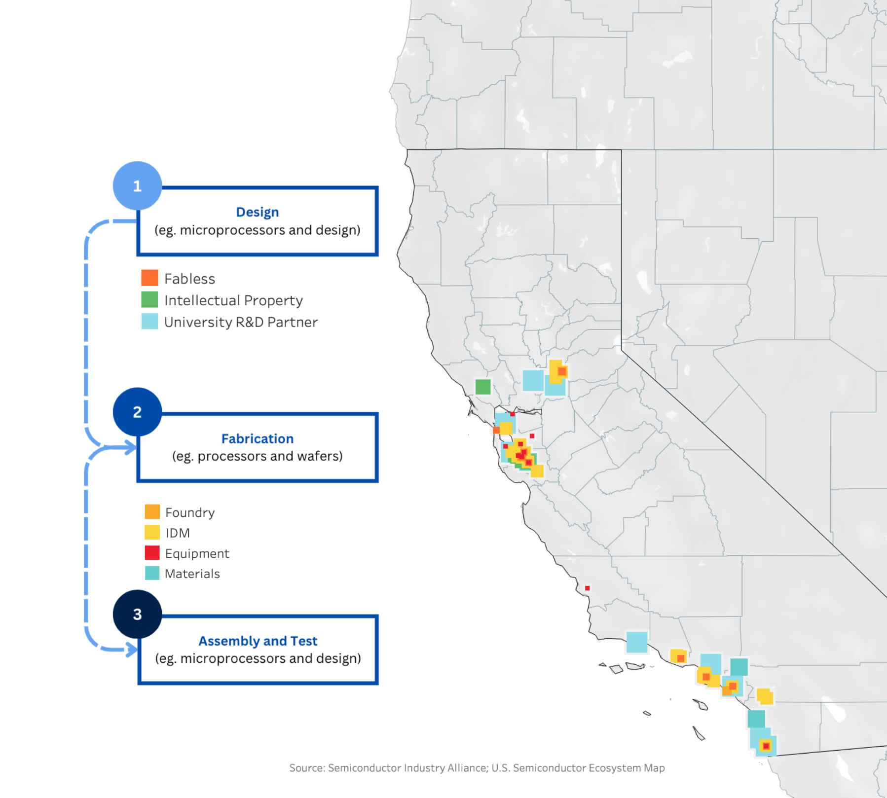
Semiconductor Supply Chain

A visualization of the three main components in the semiconductor supply chain within California.

Tools: Tableau | Date: February 2025

Data Visualization 2 Thumbnail

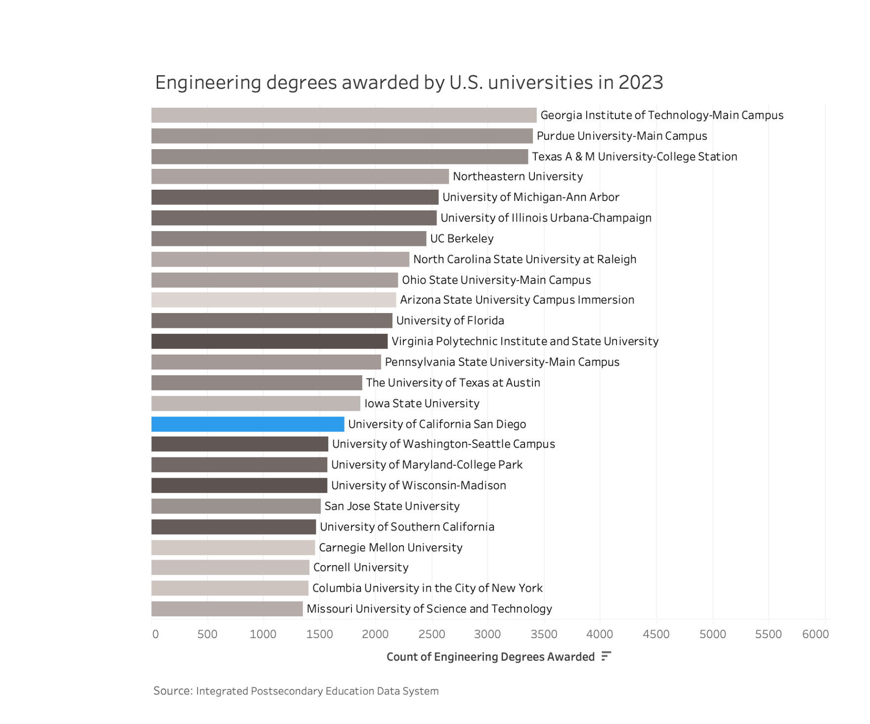
Building the Semiconductor Workforce

U.S. universities who awarded the most engineering degrees in 2023.

Tools: Tableau | Date: March 2025

Data Visualization 3 Thumbnail

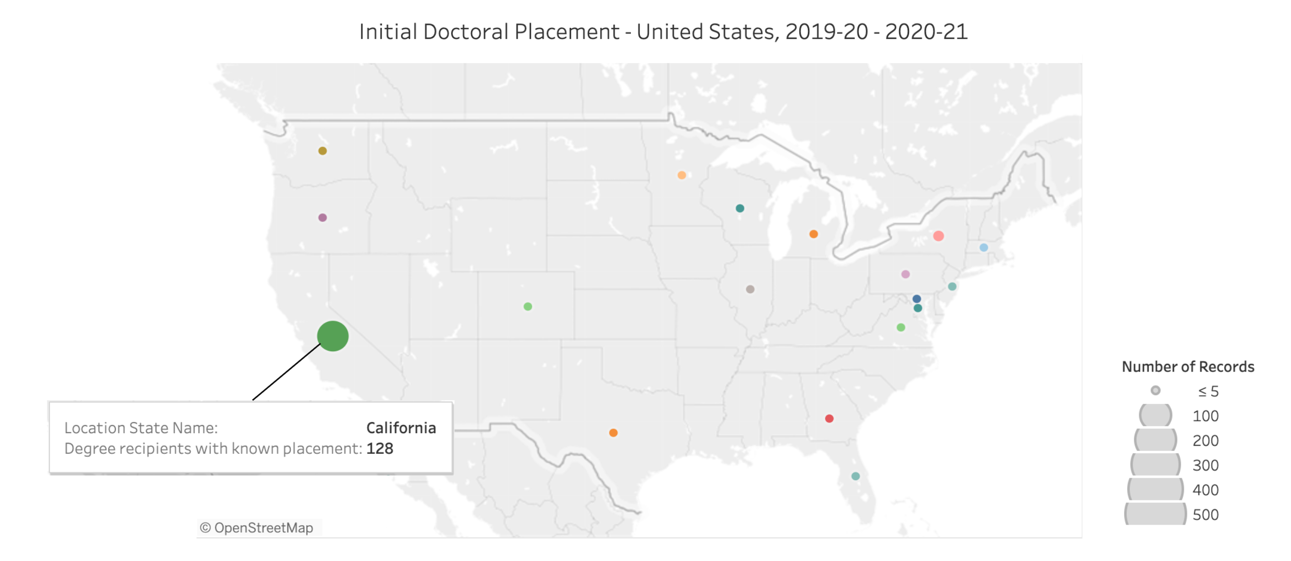
Retaining California's Top Talent

Geographic placement of UCSD engineering students who are awarded a postdoctoral degree.

Tools: Tableau | Date: March 2025

Data Visualization 1 Thumbnail

Interactive Dashboard Insights

A dynamic dashboard illustrating key trends in [topic]. Built with [tool, e.g., Tableau, Power BI].

Category: Dashboards | Tools: Tableau, SQL | Date: June 2025

Data Visualization 1 Thumbnail

Interactive Dashboard Insights

A dynamic dashboard illustrating key trends in [topic]. Built with [tool, e.g., Tableau, Power BI].

Category: Dashboards | Tools: Tableau, SQL | Date: June 2025

Data Visualization 1 Thumbnail

Interactive Dashboard Insights

A dynamic dashboard illustrating key trends in [topic]. Built with [tool, e.g., Tableau, Power BI].

Category: Dashboards | Tools: Tableau, SQL | Date: June 2025